Editing a Template
Once saved, you will be redirected to a page containing the a tool that will help you design campaign templates. This page serves as a comprehensive guide for using the editor to its fullest potential. There is a lot of reference information on this page - the starred headings in the table of contents highlight the most important features of the editor.
*Basic Idea
The Mosaico Template Designer is a rich, powerful editor that allows non-technical people to quickly craft visually appealing email templates that work on all screen sizes (mobile, tablet, desktop). The editor features a predefined set of blocks that can be dragged and dropped onto the email and quickly arranged to suit the email's purpose. Each block serves its own purpose, and within the block there are many options to customize its content and look/feel.
The base template you will be working off has most of the heavy lifting done for you. There should already be a header image, footer, and placeholder blocks for the basic structure of the specific template you are building. This guide will help you manipulate the base template in order to achieve a final product for a campaign.
*Blocks Tab
The Blocks tab contains various types of content that would be useful in an email. To add a block to the template, simply drag the preview from the left pane into the template pane.
Block Types
Here is a full list of descriptions of the various block type, presented in order of appearance in the editor:
- Standalone image (small)
- Section w/side image, text, and button
- One-column section w/header image, text, and button
- Section title
- Standalone text
- Three-column section w/header image, text, and button
- Two-column section w/header image, text, and button
- Divider
- Standalone button
- Standalone image (full width)
- Two-column image
- Three-column image
- Social media block (variant 1)
- Social media block (variant 2)
- Spacer
- Footer
Bolded block descriptions are the blocks you will most likely be using. Since the template is pre-made, you will mainly be adding section blocks for content in the body as well as spacers; the full list is presented here for reference.
*Blocks Manipulation
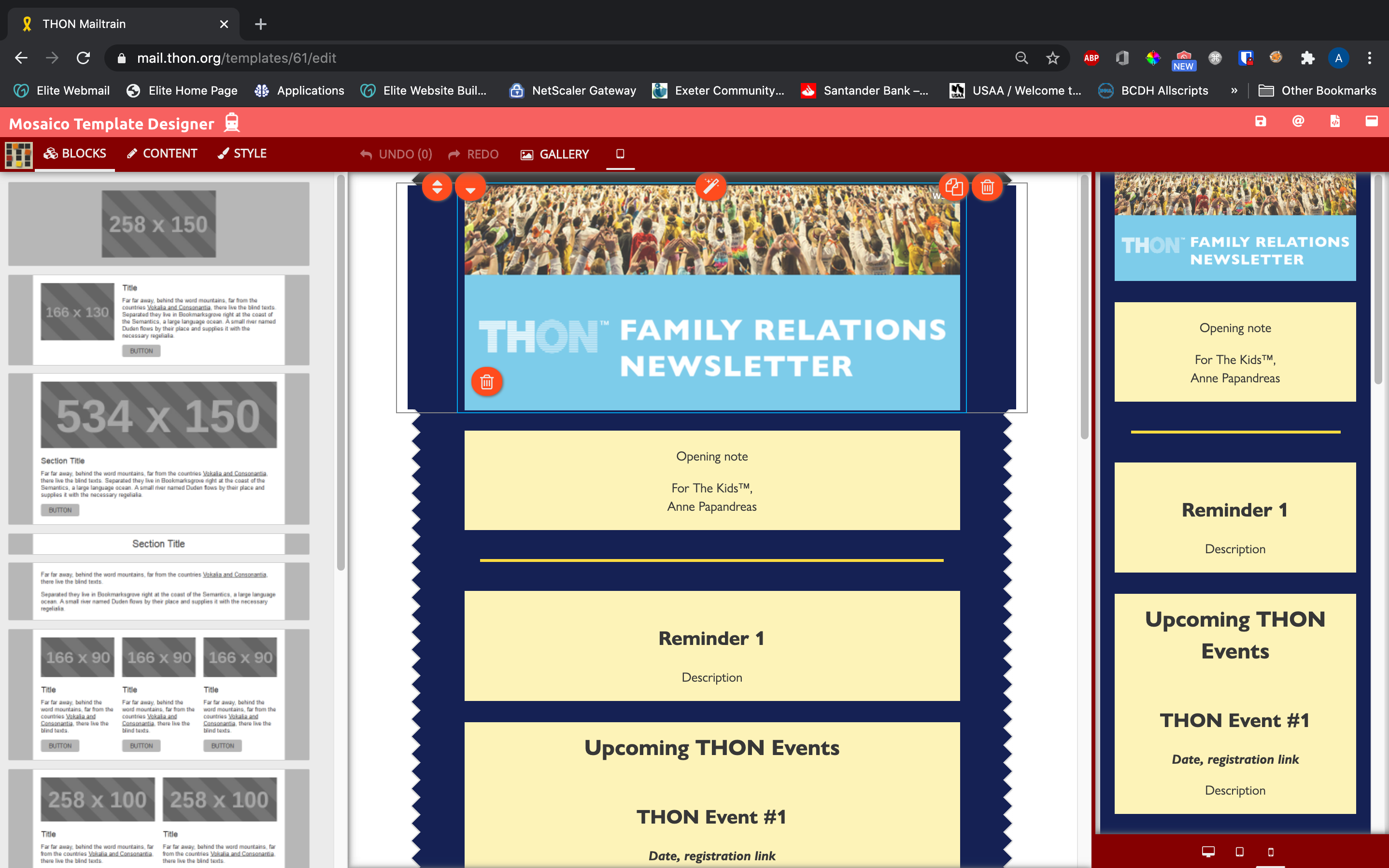
There are several buttons on each block to allow you to interact with them in the template pane.
*Editing Block Text
Blocks that include areas for text can be typed in directly. Most blocks that include text have an editing toolbar that allows you to customize the text to some degree. The full content editing toolbar looks like this:
Supported toolbar functions are listed below. Functions in bold will be of most use:
- Bold
- Italics
- Underline
- Strikethrough
- Subscript
- Superscript
- Code/raw format
- Text size / Headings
- Text Color
- Text Background Color
- Hyperlink
- Line Separator
- Text Blocking (quote, paragraph, code block)
- Raw HTML input
The text editing toolbar is relatively self-explanatory to use, as it provides similar text manipulation features to well-known programs like Microsoft Word. If you need additional support formatting text content, reach out to technology@thon.org!
In general, customize the style and appearance of block text using the Style Tab instead ofd the text editing toolbar (see below). Many functions in the text editing toolbar are also available in the style tab, and the tab provides more comprehensive control over the overall block look and feel. Use the editing toolbar for more niche customizations, like links and text emphasis.
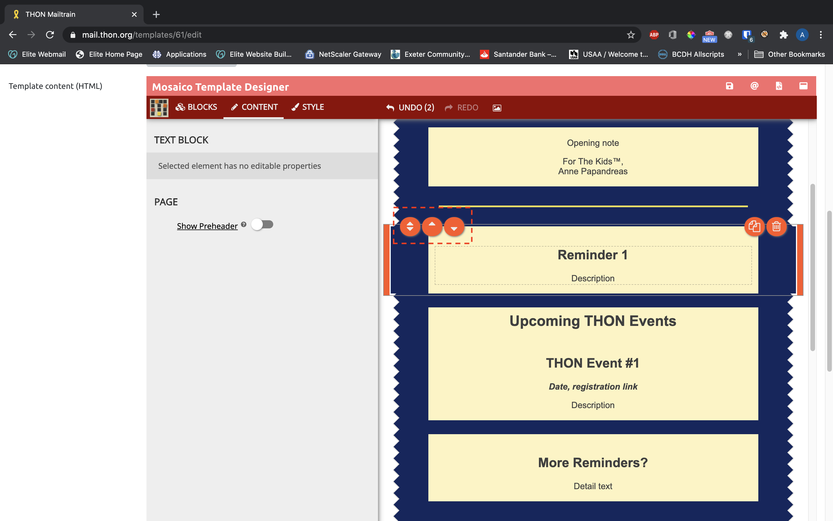
Moving Blocks
Blocks stack in 1 column on the editor and can be arranged with up/down drag handle that appear on the left side of the block. The up-only and down-only buttons next to the drag handle also allow you to move the block above and below its nearest neighbors, respectively:
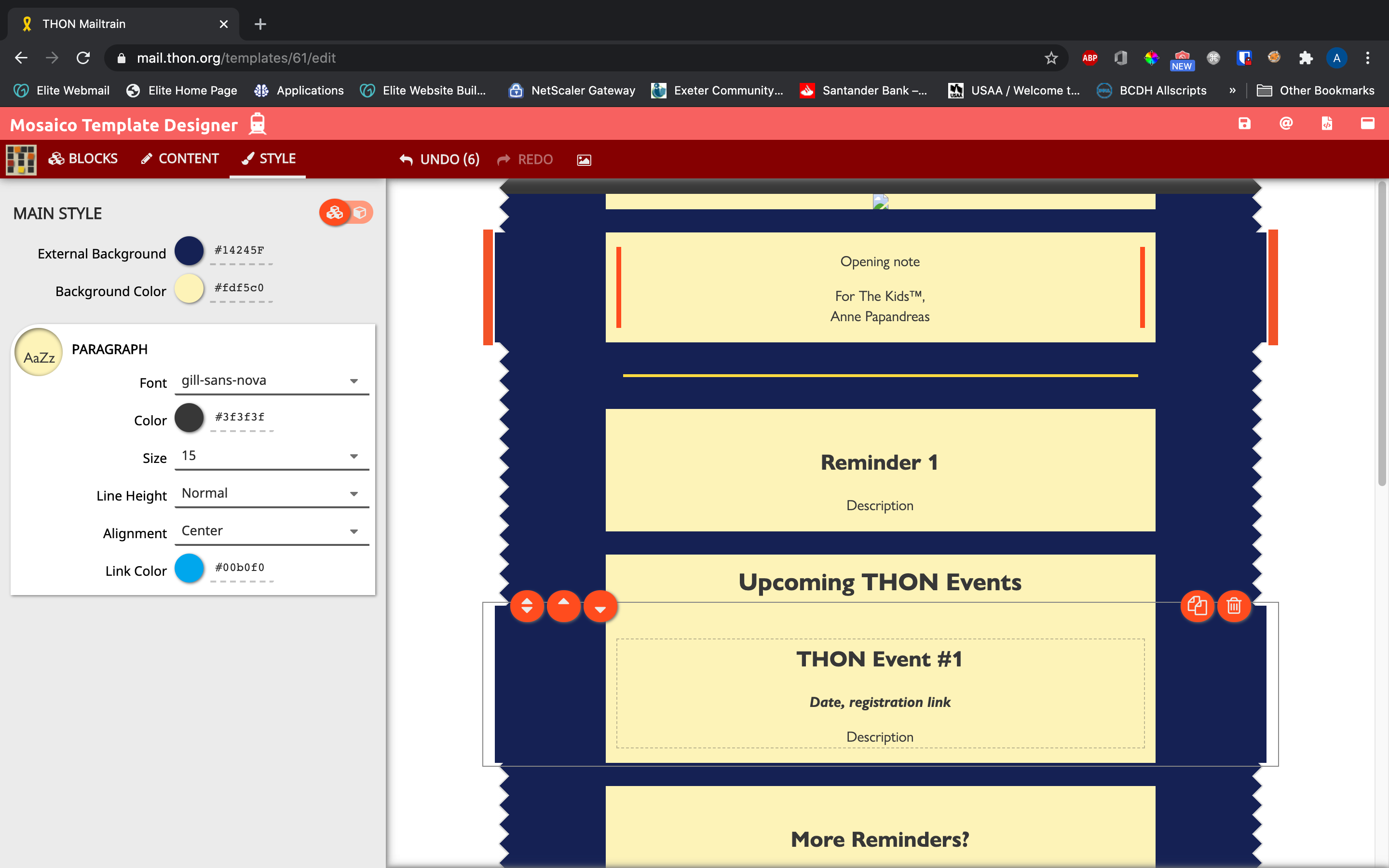
*Duplicating Blocks
Blocks can be duplicated with the orange copy button on the right side. This is a very convenient feature, because a copied block has the same styling as its clone which can save time applying styles to a brand new block.

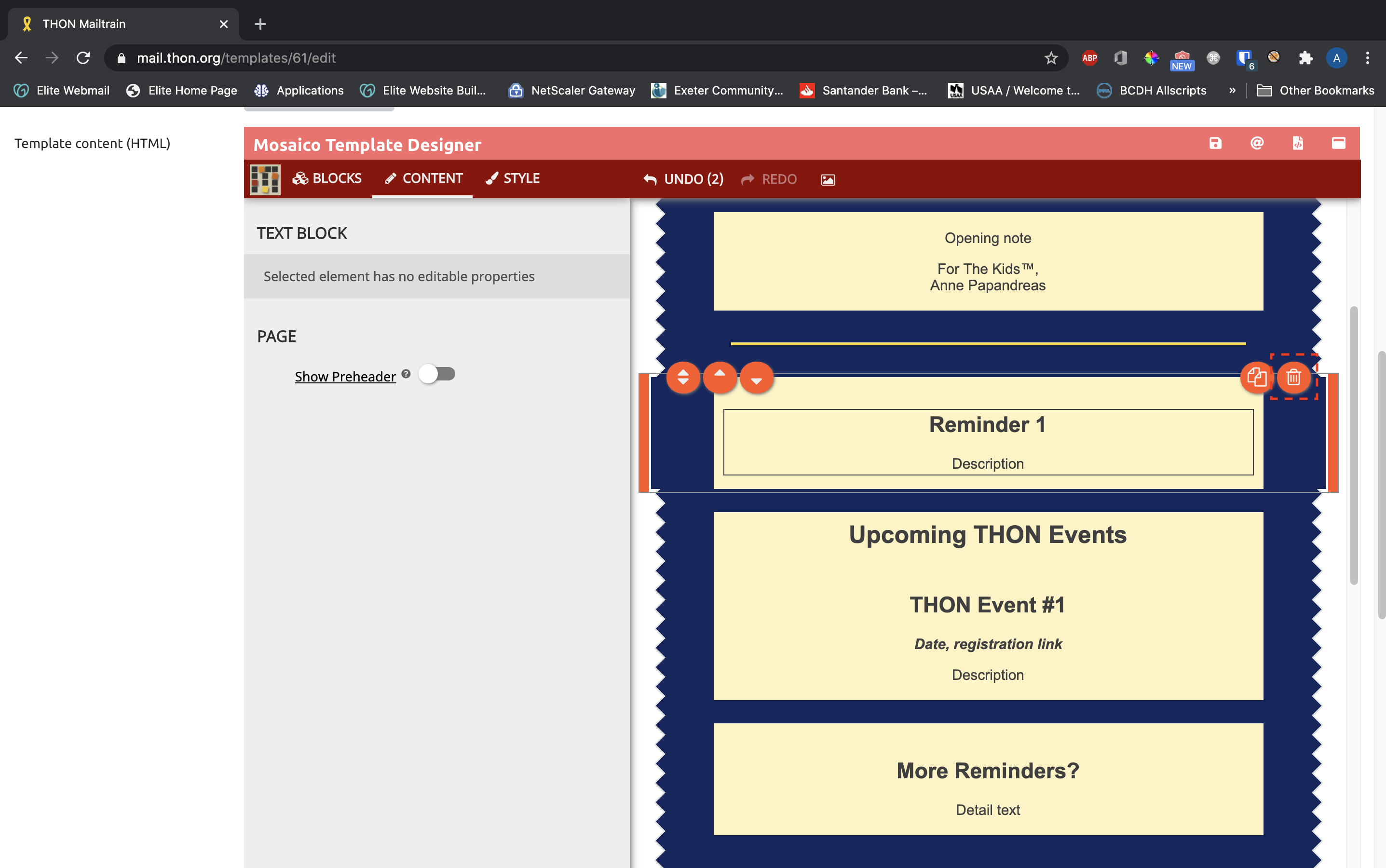
*Deleting Blocks
To delete blocks, click the orange trash can button on the right side:
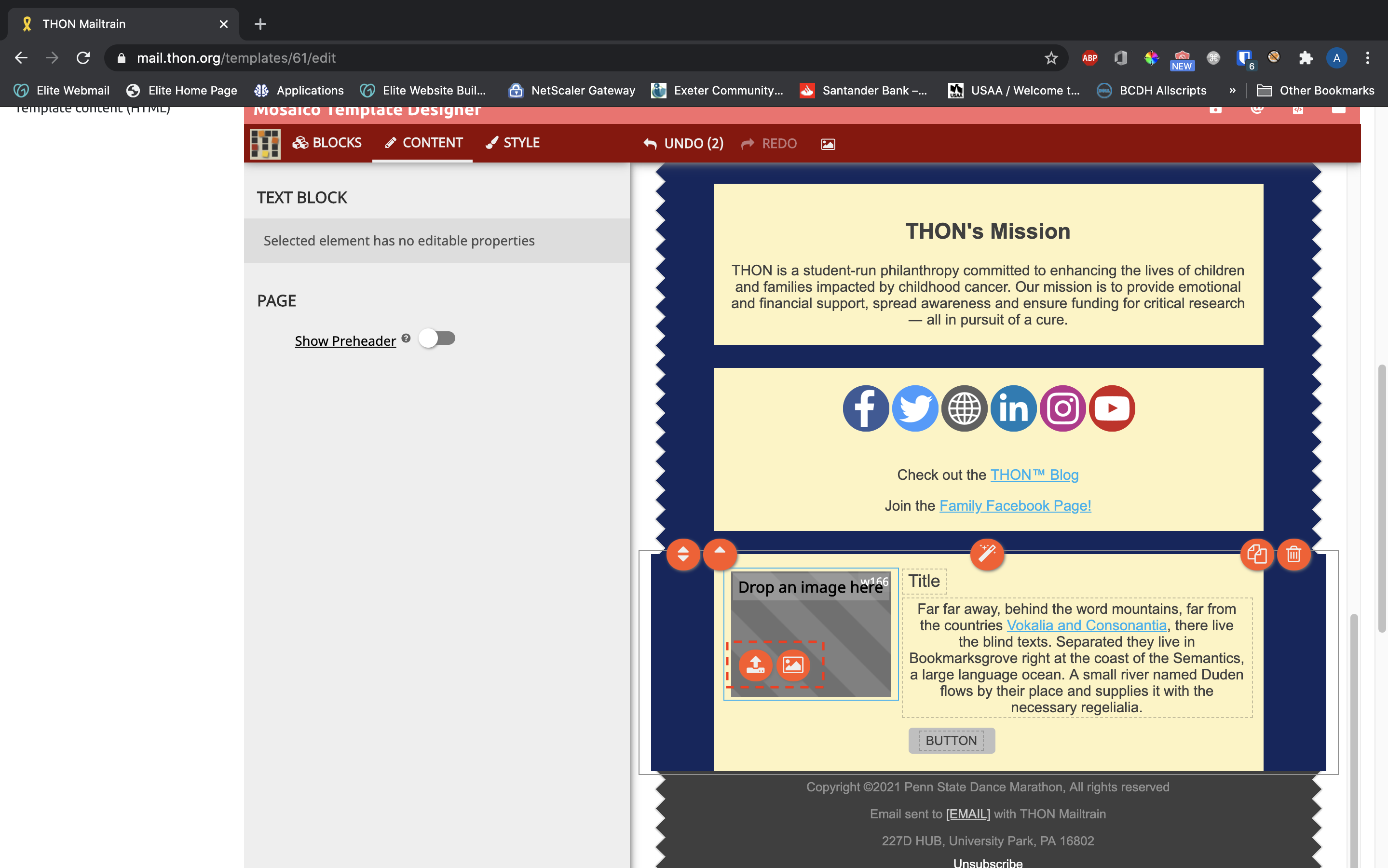
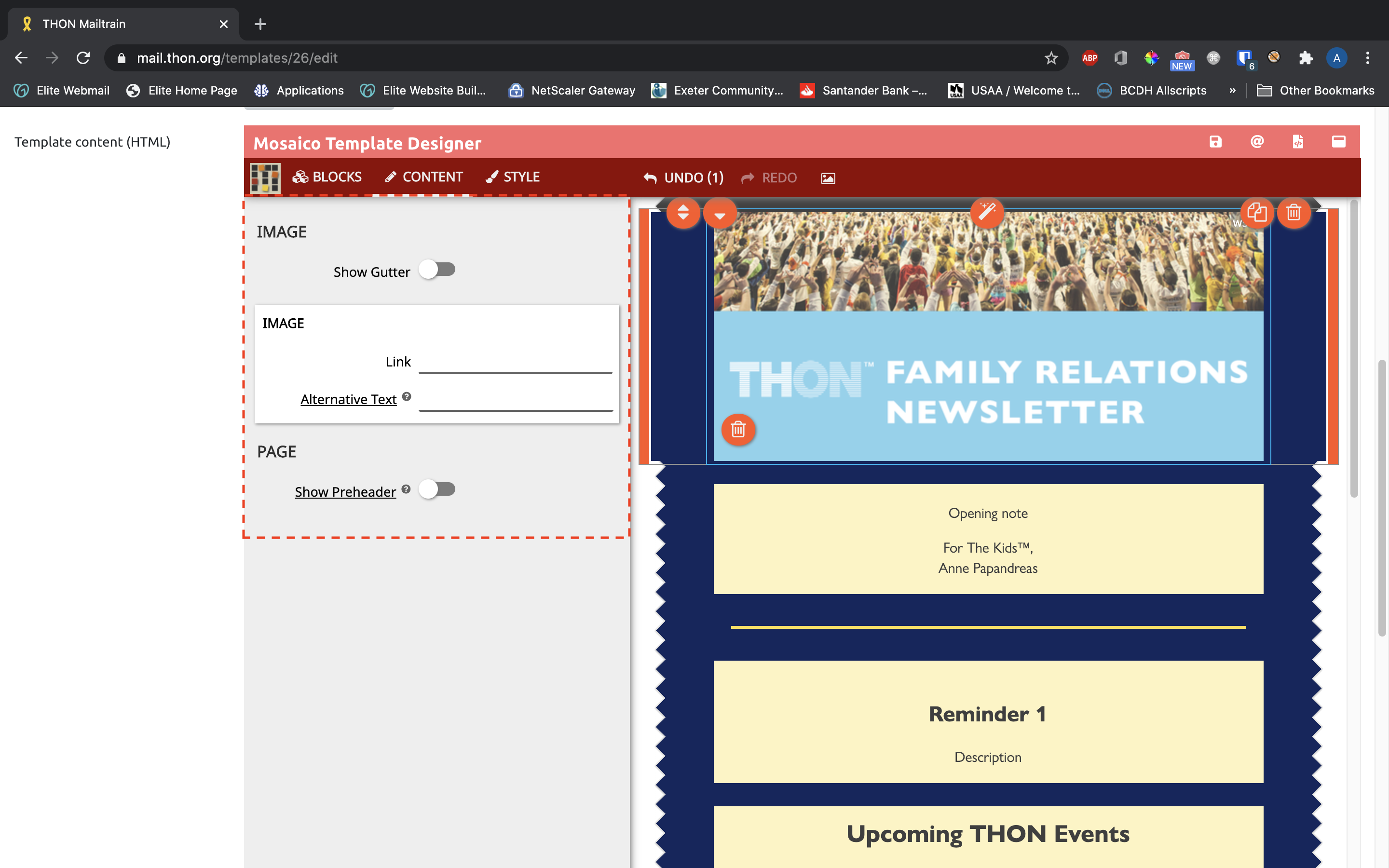
*Uploading Images (Image blocks only)
When first dragged into the template pane, image bocks will have a striped gray placeholder that will need to be replaced with content. To do so, click the orange boxed arrow button on the left side of the preview image and select a file to upload. Alternatively, click the orange photo button to select an image you already uploaded from the gallery (see Other Features).
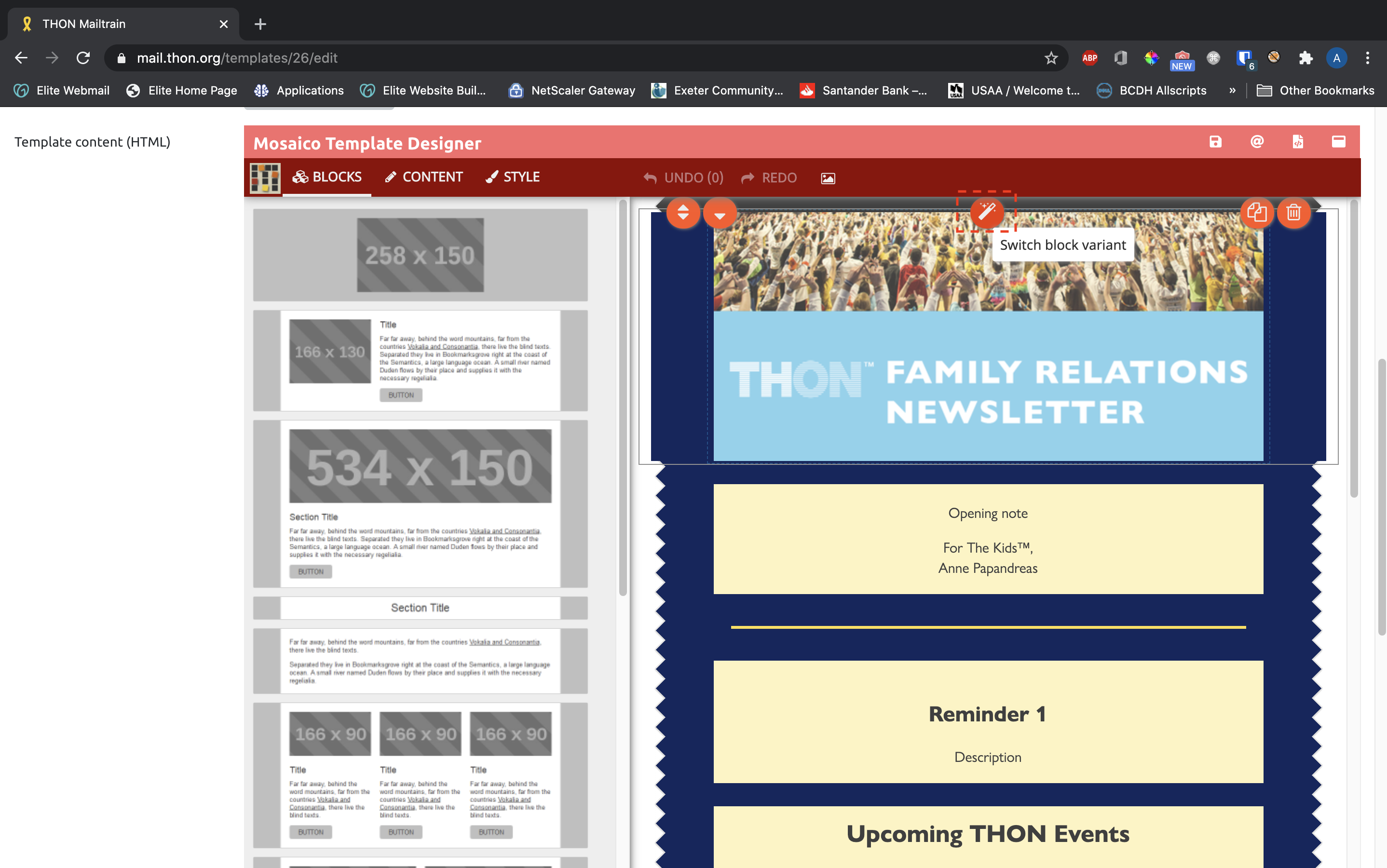
Switching Block Variants
Many blocks come in several variants that rearrange the overall organization of the block itself. To examine and swap variants, click the orange magic wand icon in the top middle of the block:
*Content Tab
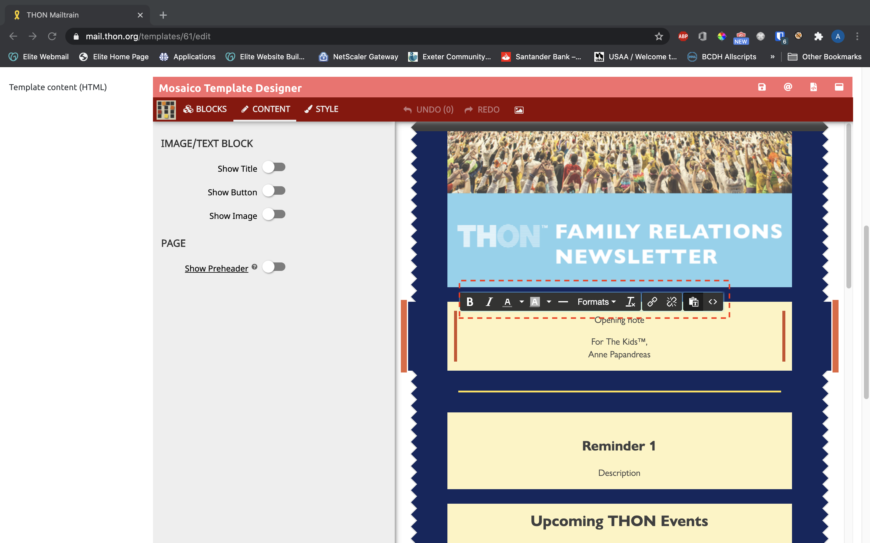
Once a block is selected, you can choose from many customization options in the content tab. Each block has its own set of customizations based on its purpose. Here are some examples of block attributes that you can customize:
- Section blocks - turn Title/Button/Image on and off
- Image blocks - customize image link and alternative text, add image gutter
- Footer blocks - customize social icons and links
*Style Tab
The style tab gives you control over the look and feel of individual blocks. The style tab operates in tandem with the content editing toolbar available on the block text itself, but the style tab is generally more comprehensive and should be used wherever possible. The actual content of the style tab varies depending on the selected block; and example style tab for a section block looks like this:
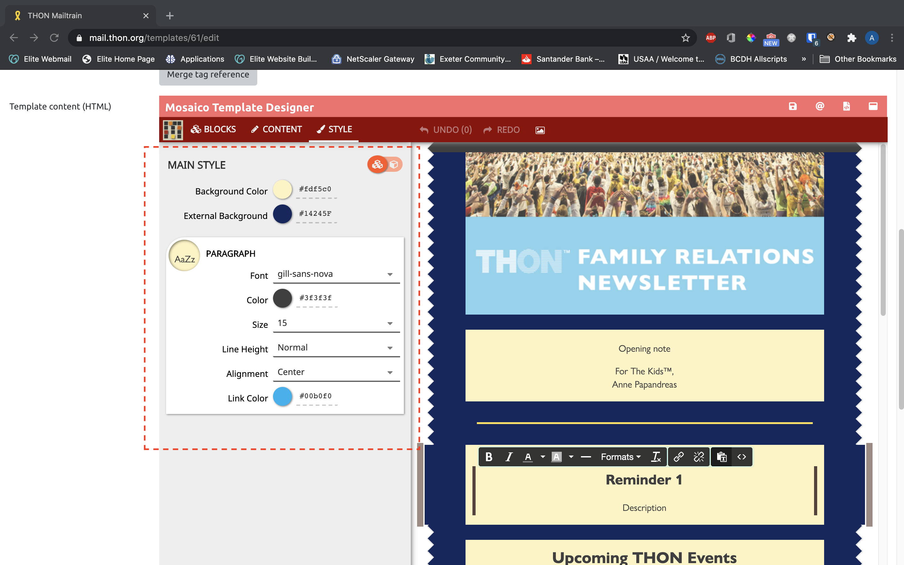
Here is an list of block attributes you can generally customize in the style tab:
- Main Style (available in most block types)
- Background color
- External background (of the surrounding area outside block)
- Paragraph (for section blocks)
- Font Family
- Text Color
- Font Size
- Line Height
- Text Alignment
- Link Color
- Title (for heading blocks and section blocks that have "Show Title" enabled in the Content tab)
- Font Family
- Text Color
- Text Size
- Text Alignment
- Button (for button blocks and section blocks that have "Show Button" enabled in the Content tab)
- Font Family
- Text Color
- Font Size
- Text Alignment
- Button Color
- Corner Radius
- Separator (separator blocks)
- Separator color
- Width
- Line Height
The style tab can take some getting used to - feel free to experiment with tweaking different block attributes until you feel comfortable. For further guidance, reach out to technology@thon.org.
*Global vs. Block Level Styling
One important yet somewhat confusing of the style tab is the orange slider in the top right of the pane:
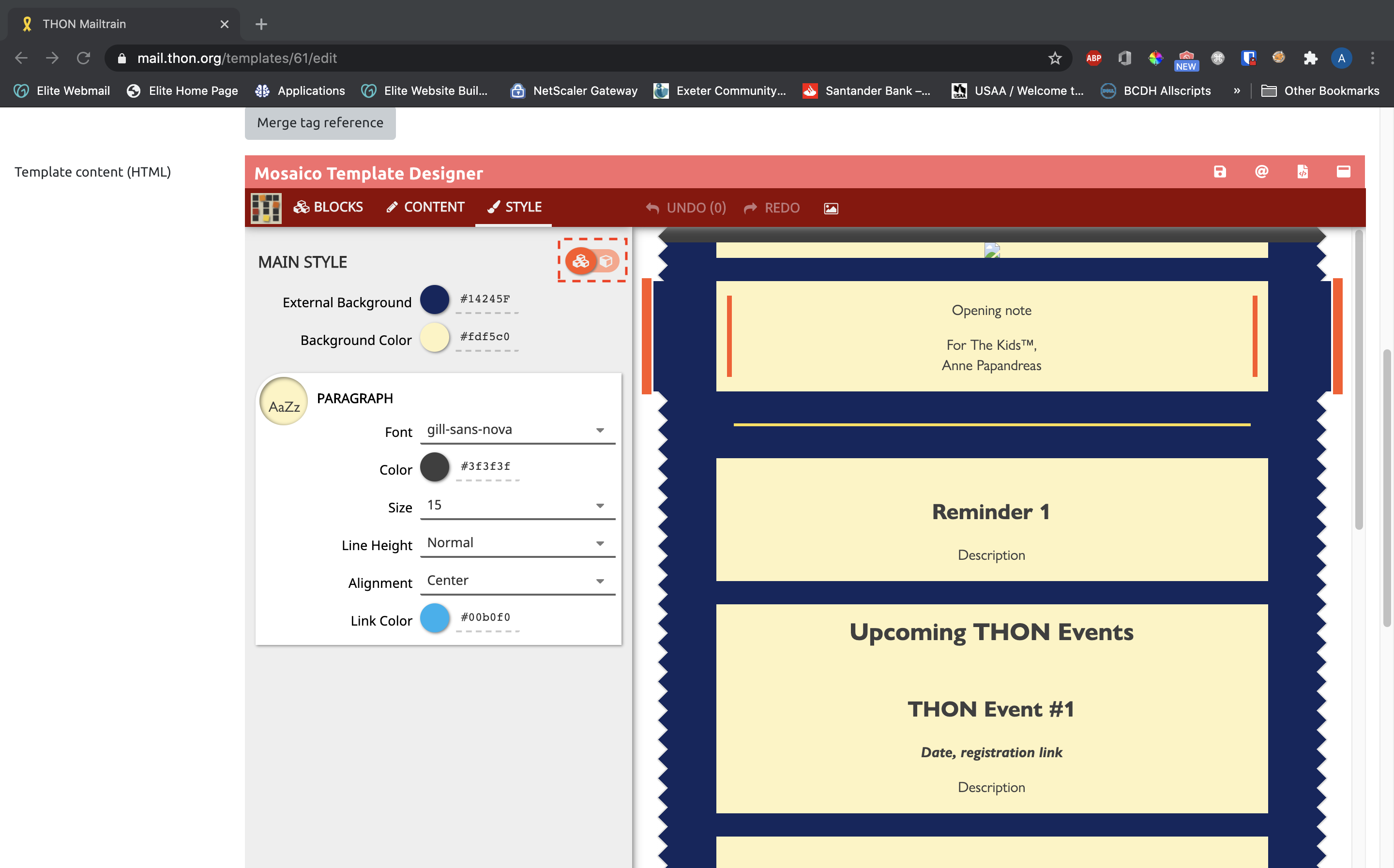
This slider controls how many blocks the style options displayed apply to.
- When the slider is switched to the left (three-block icon): the style tab is in global mode. All changes made to fields on the style tab will be applied to all blocks of the same type on the template. For instance, if you were editing a section block and had the slider set to global, every change you made would be applied to every section block in your template
- When the slider is switched to the rigth (one-block icon): the style tab is in block-level/individual mode. All changes made to fields on the style tab will be made only to the currently selected block. This is useful for designing a block that should look different than other blocks of the same type.
In general, it's safer to edit blocks in block-level/individual mode to prevent unintended styling changes to other blocks in your template. Experiment with the feature to get comfortable with the differences between global and block-level styling.
*Branding / Color Reference
Most base templates have been designed with specific design considerations in mind to align with THON's core brand. Here are some guidelines to follow to maintain brand consistency:
- Always set "Font" to gill-sans-nova on the style tab. This is the official THON-branded font and should be used at all times
- Set External Background to #14245F for most templates
- Set Background Color to #FDF5C0 for most templates
- Set Link Color to #00B0F0 for most templates
- Set Color for separators to #FBE04C in most templates
- Set Color for text to #3F3F3F for most templates, unless your template uses a different color, in which case just use keep the color consistent
- Don't modify the header or footer of the email template, as these have been pre-configured by TECH and should not vary between campaigns
As a general rule of thumb, try to keep the look and feel as consistent as possible when adding content to existing base templates. You can use the copy feature to make your life easier, as existing blocks in the template are already branded.
Other Features
There are a host of other smaller features in the Mosaico editor that make life easier for users.
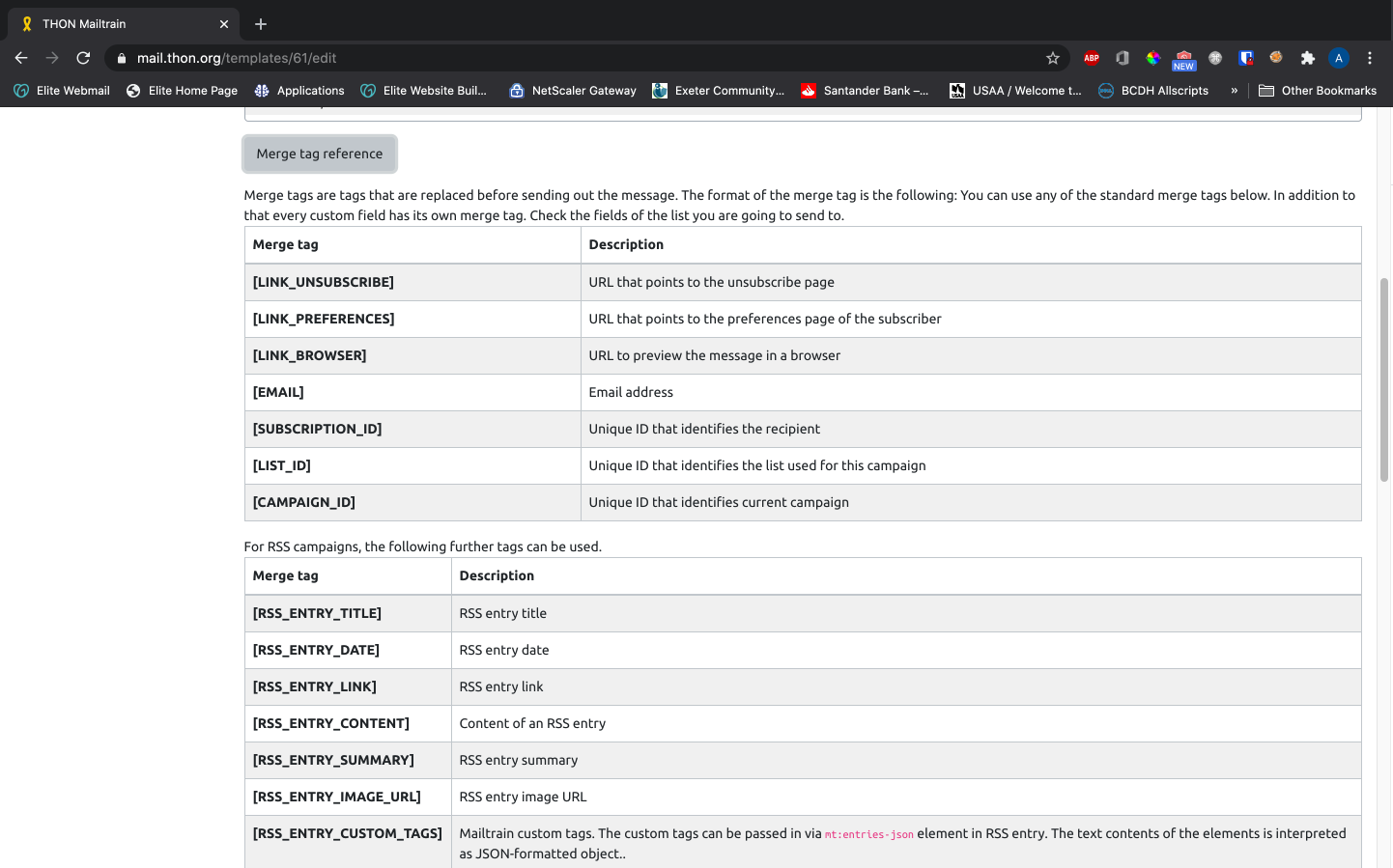
Merge Tags
If your list has custom fields like first/last name, Mailtrain can work simliar to Mail Merge to insert this per-subscriber information directly into templates. Click Merge Tag Reference above the editor itself to view a list of available tags, and consult the list you will be sending the template to for additional custom tags. While powerful, this feature will probably not need to be used by the vast majority of Mailtrain users.
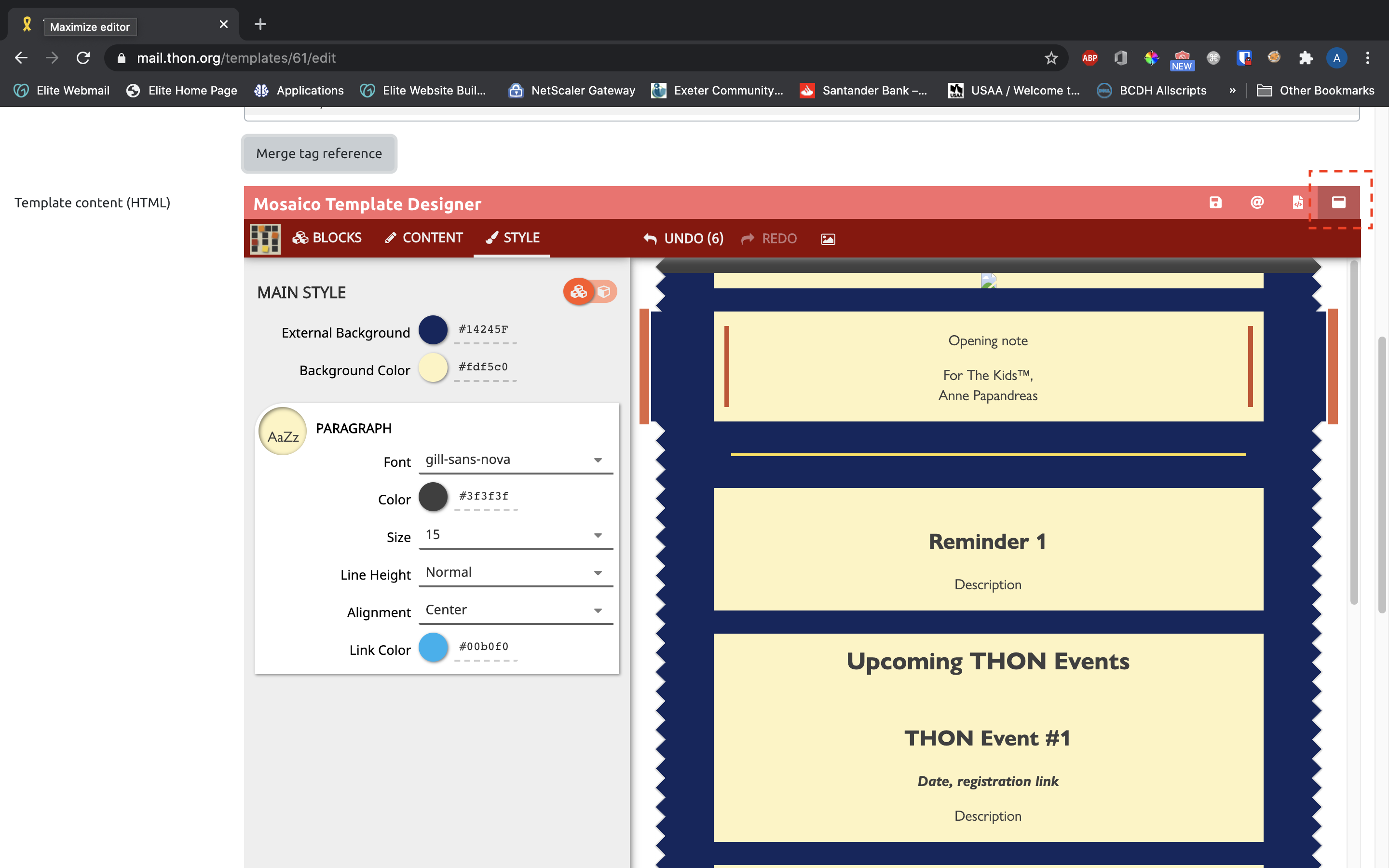
*Fullscreen Editing
The embedded editor can be maximized to fill the entire screen by clicking the white fullscreen icon in the top right corner:
*Undo/Redo
All changes made during an editing session (i.e. between clicking Save) can be undone and redone with the undo and redo buttons in the secondary red toolbar, respectively:
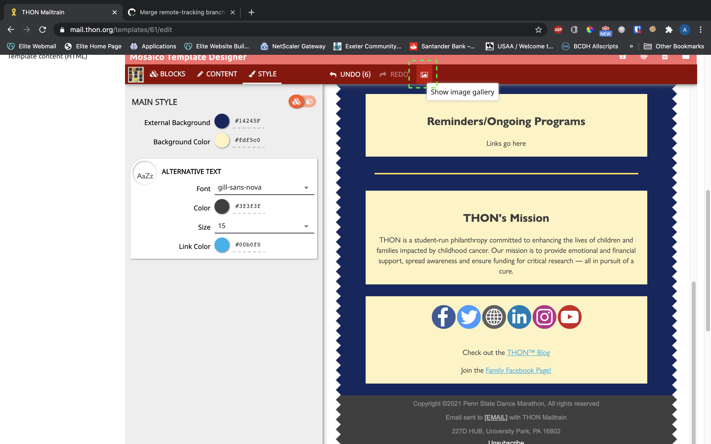
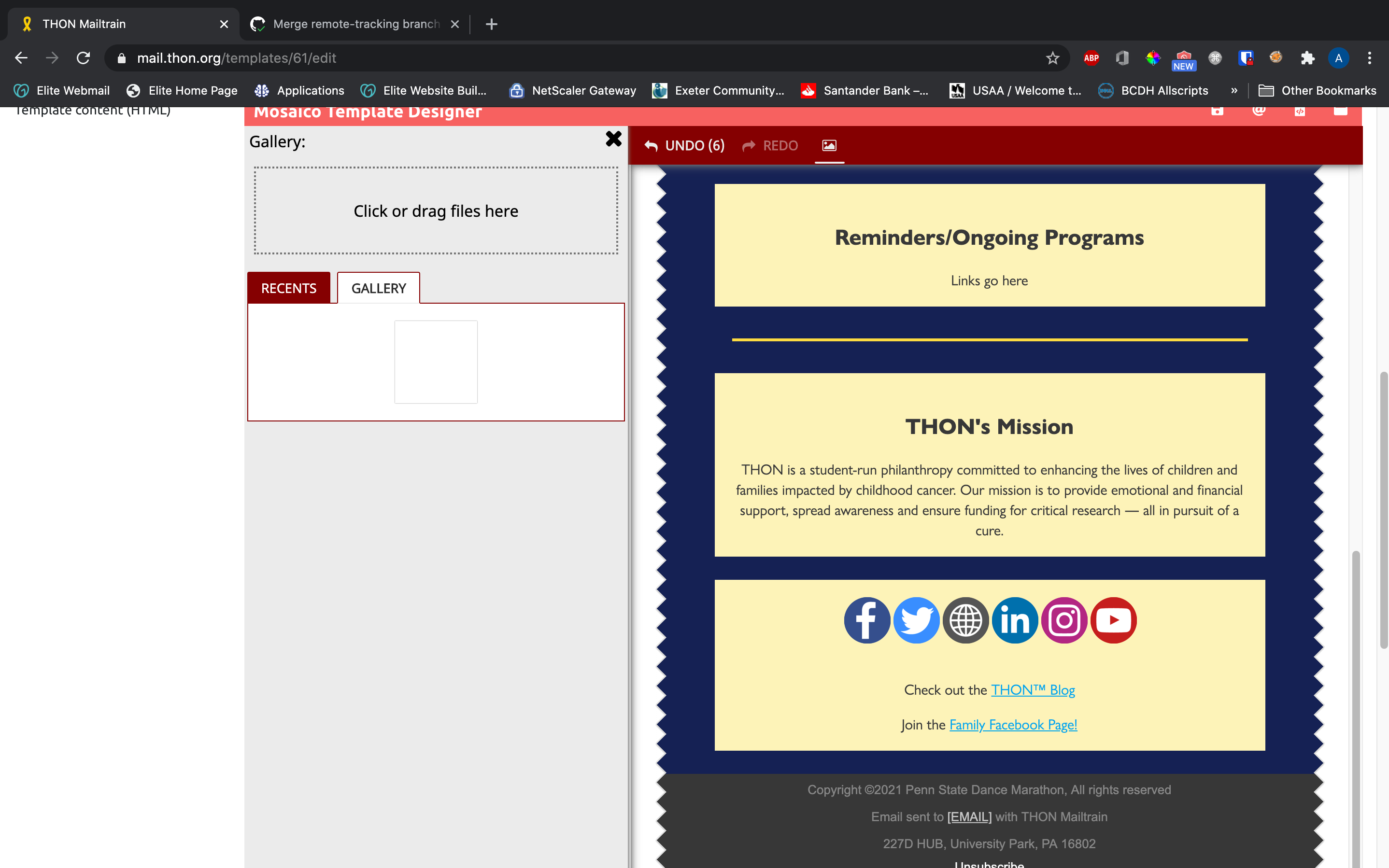
Photo Gallery
The Mosaico editor features an image gallery containing all images uploaded to the template since its creation. You can access it by clicking the white photo icon in the middle of the secondary red toolbar. You can upload images directly to the gallery for later use, and you can alternatively add images to blocks from the images in the gallery (see above). This feature is completely optional to use, and you can alternatively upload images directly to blocks rather than use the gallery. Here is how to access the feature:
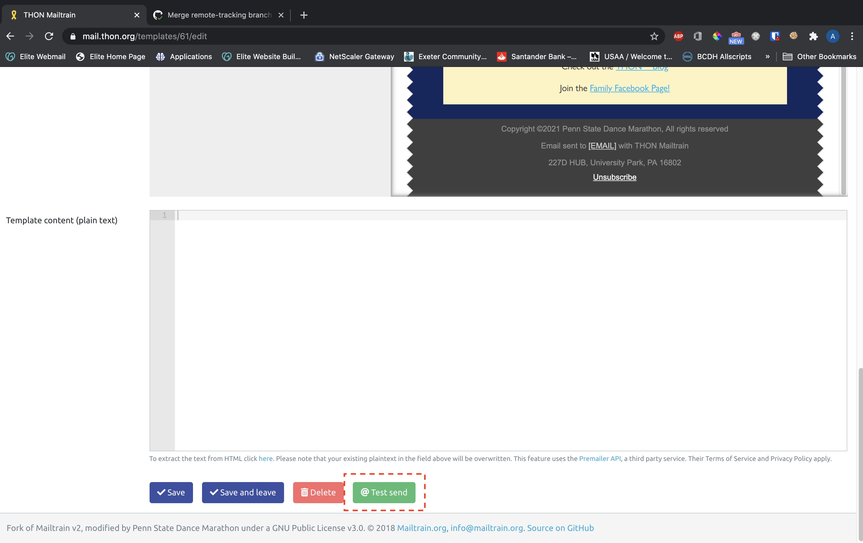
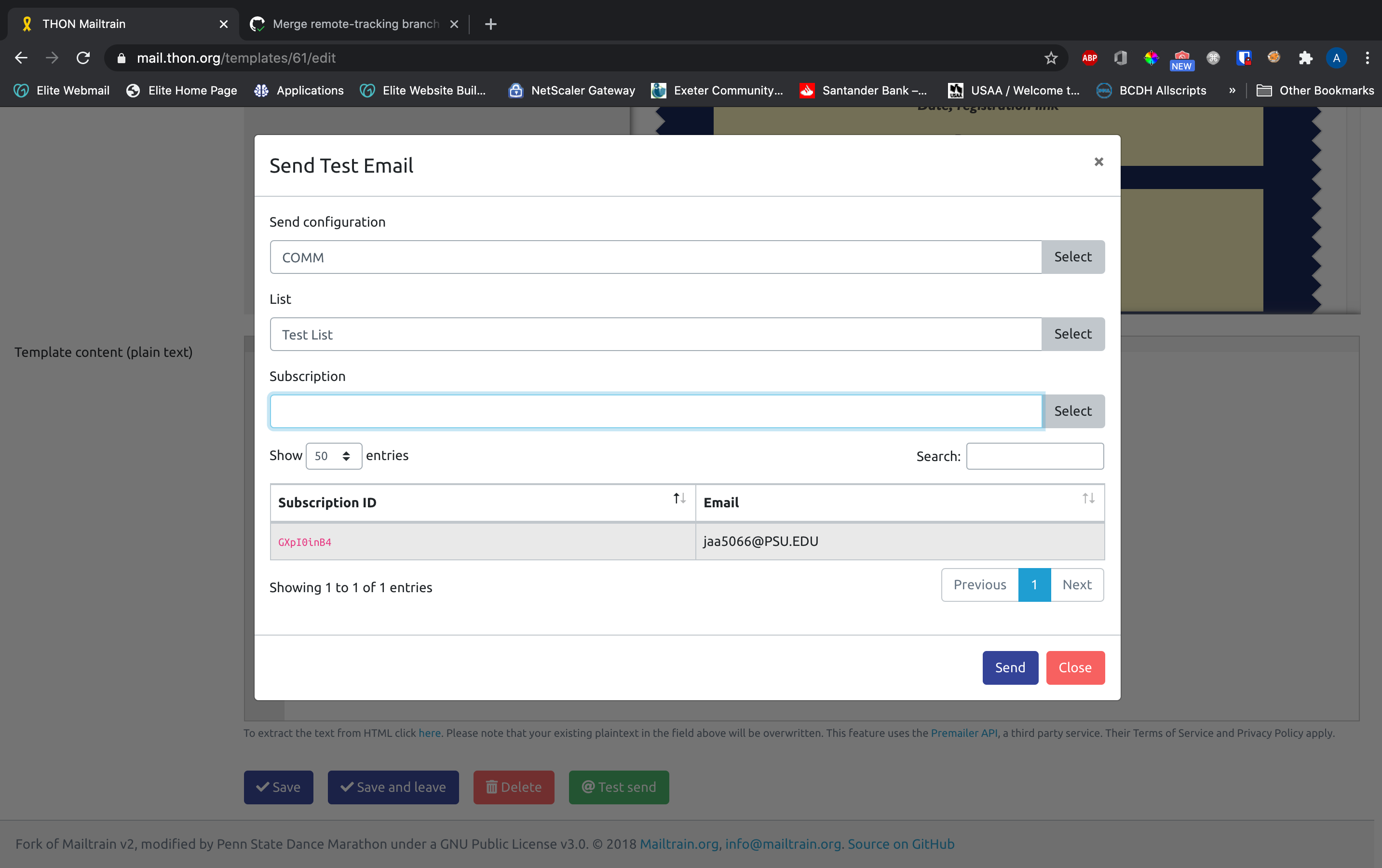
Test Send
You can send a test email of your template to test how it will look in an email client itself using the green @Test Send button at the bottom of the page. You need to select your committee's send configuration, a list to test on, and a test user on the list. To test send to yourself, you will need to add yourself as a test user on a list - see the article "Adding Subscribers" on adding subscribers for information on how to add your own address as a test user to a list.
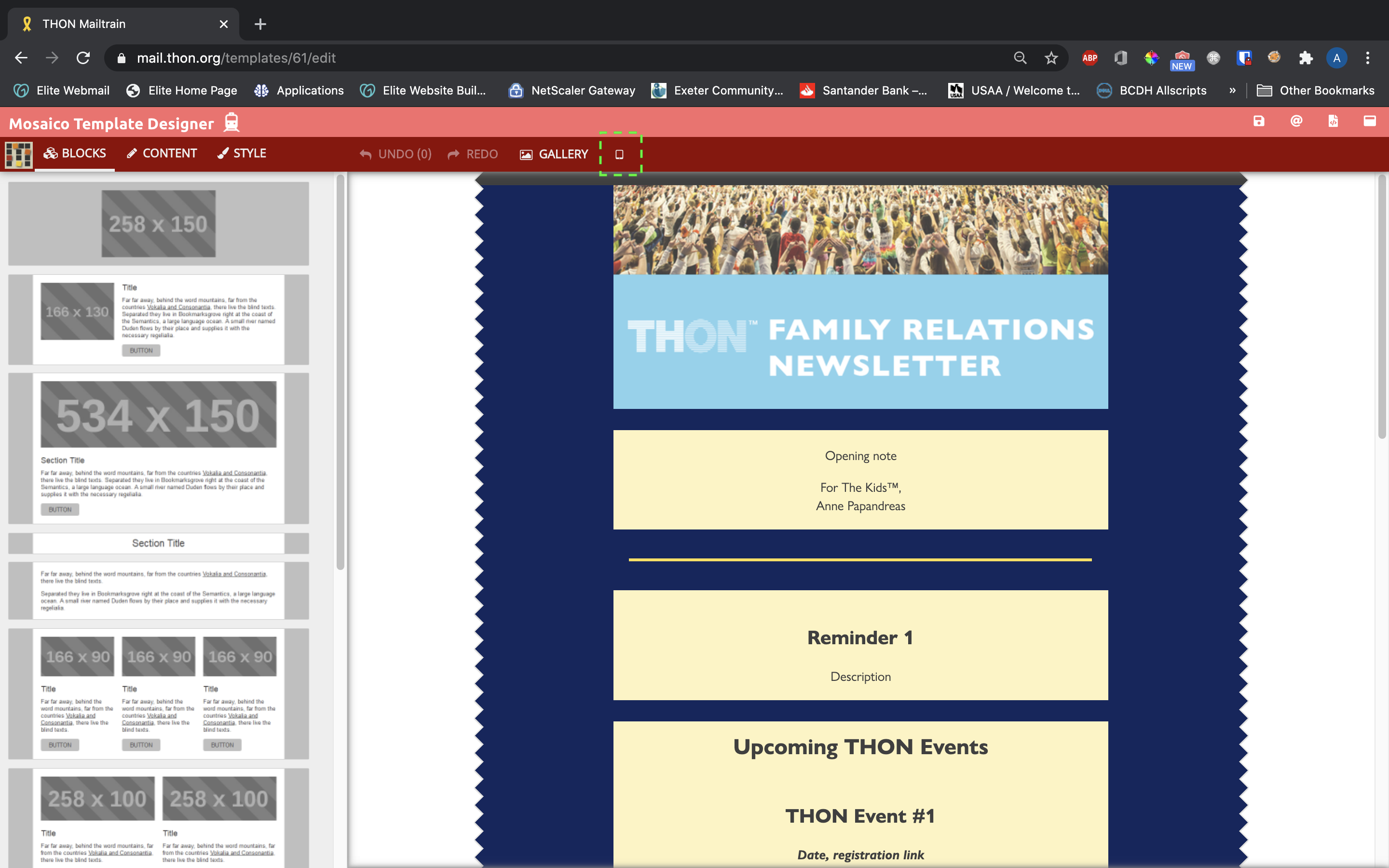
Live Preview
The Mosaico editor offers a live preview feature to allow you to see how the email will appear on different screen sizes. To open the preview pane, click the white phone icon in the secondary toolbar to the right of the gallery button. The preview pane offers three different screen size previews - phone, tablet, and desktop.
Visibility
The preview pane button only shows up on larger screens due to the amount of space it needs to fit. For best results:
- Preview with fullscreen mode active
- Zoom out of your browser to give the tool enough real estate to work with